This concept is a universal composition rule, which should be understood -- at least in part -- by all photographers.

Don't place the important stuff in the center! That is basically how simple the rule of the golden section can be put. Do not place anything significant in the middle of the picture.
If you just learn that and nothing else, you will probably be able to compose some images with visual tension and dynamics. Placing things in the center creates a symmetry, which can be visually exciting if done properly, but only when used on purpose. If you want your "ordinary" pictures to have some style, this article may help you.
OK, not always!
I know the argument will come, so let me just start by saying: this does not always apply! Of course this is just one of the many ways to compose images. And often you don't need to compose at all. But it's a good rule, and if in doubt about a motif, think in fourths.

Fibonacci
The golden section or the golden ratio is in essence mathematics. It's a formula describing the relation between length and width of a rectangle, but also a formula that can be applied on a description of the division of a picture into sections.
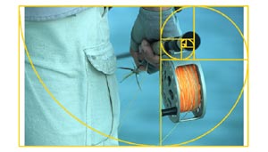
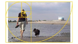
The Italian mathematician Fibonacci found a series of numbers back in the 12th century. When these numbers are plotted as a curve, you get something which almost fits a golden section.
I will not explain the mathematics in detail, but just show you how it can be used to find the "hot spots" and "hot lines" in a picture frame and how you can create good composition by using such a division into sections.
The catch is that the golden section is a harmonic section and a ratio between width and height, which is pleasing to the eye and in balance without being symmetric. Don't ask me why this is so. I can just see that it's true. Pictures, which fit into a golden section grid are generally nice to look at.
Fourths
 The easiest way to imagine the golden section applied to an image is by dividing it into 16 equally large rectangles and then removing a couple of lines. Split your imaginary screen with three lines vertically and three horizontally. What you get is a 16 field grid. Now remove the two central lines, and you have a plane split into nine parts with four intersections between the lines.
With that done the scene is set, and you can now focus on the hot spots of the image. These are the areas where the lines cross. They happen to be approximately where the golden sections of the image is -- approximately. Because according to the mathematics it's not exactly fourths we're dealing with, but you know what? We don't care! Fourths are a lot easier to deal with and good enough for our purpose.
On the image below you can play with the different curves and grids and even see the Nikon D200 grid overlaid on the whole thing.
Out of balance is in balance
So the whole idea is not t0 place areas of focus (viewer's focus, that is, not the camera's) in the center or on the center lines. If in doubt or if there is no specific reason to be symmetric, place anything interesting in the "hot spots" indicated by the four green rings above.
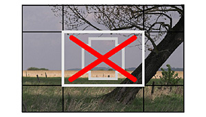
And feel free to leave the center of the image completely free of interesting things. That empty space will just enhance the dynamics created by the use of the golden section.
The image in the example below has nothing really in the golden section points, but by avoiding having anything in the center, it still gets that nice harmonic unbalance.


