I have always wondered why photography web sites have to be so ugly in their design.
The black death
Give us some air, please! Light, whitespace, readability... just a bit of style... like in your pictures.
For some reason, some of the best photography sites contentwise are some of the worst designwise. I have always wondered why photographers, who take some of the best images I know and do such a wonderful job of combining composition, colors and style, do such a miserable job of designing their web sites.
I know that I have to tread carefully here, because this site is not exactly a design icon. But I still try to maintain just a little style, and at least use the latest methods and a few of the current trends in the way that I structure it. But anyway. Some photographers have worse design than I have.
And just for the record: I love every single of the sites below, and while it may seem to be pure trashing here, that is not the case. I just ponder about design vs. content a bit...
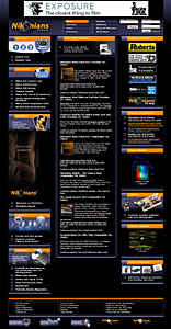
Nikonians
Nikonians.org is a ressource that I only recently started using, but honestly got very tired of because of its really strange structure and extremely confusing layout. Black again, of course, but worse than the average.
The site is commercial, paid by advertisement, a shopping site and the users. You can sign up for a membership, and I might just do that, but none of the paid benefits seem to overshadow the fact that this is one confusing site that doesn't really appeal to me structurally and visually in spite of its great content.
You can sign up for silver, gold and platinum memberships, costing between 25 USD and 200 a year. I'd like to support the community, but I'm not sure I will use the majority of the site enough to feel like I get what I'm paying for.
The only thing that I will continue using intensely is <the podcasts, which are really excellent. I particularly enjoy the Image Doctors and the series Behind the Lens. Jason Odell and Rick Walker as the Image Doctors are perfect for this job. Very knowledgable and really good behind the mike, always covering interesting subjects and obviosuly having fun doing these podcasts.
The rest of the site has not impressed me. The articles are OK, but lack illustrations if you ask me. A photo site should be littered with photos. The forums are active enough and host a lot of discussions amongst people who know what they're talking about, but the structure of the forums and the numerous bright colors (orange, purple and blue!) on the black background makes it a blessing to return to the gold pot of this site: the podcasts.
Won over
January 2008: I have to admit that I was won over by the Nikonians, and now participate and contribute with the podcast "On Location with Martin Joergensen" and have a great time doing it.
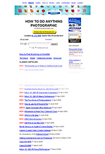
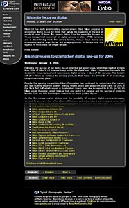
Ken Rockwell
Ken Rockwell has one of the best ever personal sites on photography and one of the few sites that I visit regularly. He writes very well and has a worthy opinion about most things that he touches. He does take some eminent pictures too, and has a pragmatic approach to photography, which is just up my alley.
His site might not be really ugly, but it's not exactly stylish either. The front page is simple and never changes. It's just there to click through. Most second level pages are mile-long lists of article headings in large types. Articles are generally OK, but not really thrilling in layout.
But the content of course weighs more, and I'm still a die-hard fan.
Ken has some classical pieces on photography and photographers.
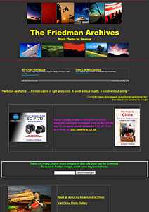
Gary Friedman
Gary Friedman is an old Minolta guy, whom I've read on and off over the years mainly because of that fact, but also because he's a pragmatic photographer and writes pretty well. His words appear on various web sites and in different magazines.
But his own site's layout is marred by strange colors, table frames galore and large yellow type on black background. The whole thing smells of Microsoft Frontpage, a web design program, which has never been my cup of tea, and not really a tool that lives up to today's standards regarding web management.
What I most like about Gary's site is the huge amount of images that he has online. He does not hide that fact that he's selling them, and he manages to show us lots of high quality pictures.
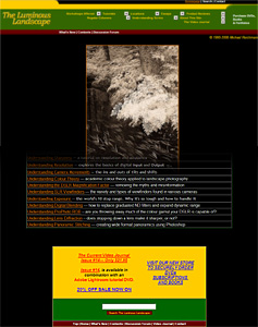
Luminous Landscape
Luminous Landscape is a great site for not only landscape photographers but everybody who likes nice pictures. The images are nice, and Luminous Landscape has some really great articles, but why does it have to be packaged in these huge, colorful types (white, yellow, orange and red) on a black background?
And check out that navigation in the top. Whoa! That requires some getting used to.
But in the depths of this site is some of the best technical writings on the web, and if you want to understand depth-of-field, bokeh or other technical aspects of photography, this is a good place to go.
Update: Luminous Landscape has changed its really wierd navigation with the drop-downs in the top of the page and replaced them with a more common left hand menu. But the rest seems to remain the same, and that is far from good.
Digital Photography Review
DPReview was one of the first sites on digital photo that I spent a lot of time browsing. I don't go there much anymore. It's just too much gear and too little photography if you ask me. I do use the site as a reference for all the cameras that I bump into, but it has very little on lenses and almost nothing on photography as such.
I have always used the site as a prime example of organization. It's a text-book example in building a large, automated website. It has all the facilities needed to navigate that huge amount of material.
But I have also used it as an example of a crammed, dark, hard-to-read design, which makes it really difficult to stay concentrated through the long texts.
Phil Askey and his staff do a wonderful and unsurpassed job of reviewing gear, but still I find it like entering a dark, steel-plated tomb when I visit. I often find myself selecting all text to quickly get a dark blue writing on white background or clicking Print Page, which will render the whole thing nicely on a white background and remove all disturbing ads as well.
Phil Greenspun
Phil Greenspun has been around as long as I have, and that's quite a while. He started the well-known site photo.net back when, and it was a study in simplicity, just like his personal site is now. Phil's writings were always readable and very much to-the-point, and his pictures classically simple. His travel stories are real jewels.
The font is times, the background is white, links are blue with underlining and images are just scattered in there with blue rims indicating that they're clickable.
That was photo.net for many years. Right now it has a few strikes of design, but isn't exactly world class in that respect.
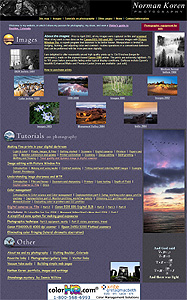
Norman Koren
Koren's web site is an amazing collection of very in-depth and thorough articles on a number of subjects. He excels in the basic understanding of the digital capture, color management and processing technology -- sensor physics, algorithms, converters -- but also has some really fine articles on photography, printing and other subjects.
His scope is clearly technical rather than creative, but his pictures show that he 's a very able photographer too.
But... of course his site is dead ugly! Strange purple or baby blue background textures, Comic Sans font for headings and intros, lots of blue in frames, links and elsewhere -- when things are not a brownish red or purple!
Photography in Malaysia
Photography in Malaysia or mir.com.my/rb/photography/ is a strange and fascinating site. It is not about photography in Malaysia as such, but more about equipment.
It looks crammed and messy -- which is also is -- but it contains an amazing selection of gear articles, and the most complete span of text and images on some of the classical cameras and lenses from all manufacturers.
The depth and detail of these articles and the accompanying photos deliver hours and days worth of reading, and it all seems precise and to-the-point. When I read about the gear that I own or have owned, I can only nod at what I already know and smile at all the new stuff I learn.
But of course all this is packed in a strange wrapping. The front page is black with white and blue writing. Luckily the text pages are black on white, but just to confuse the font size varies a bit from page to page. And the navigation in the bottom of each page is impossible to decipher and contains way too many links to grasp. And it differs for each page.
But the site has so much information, so many images and so many details that I'm almost willing to forgive the design.
Naturfotografen.com
Børn Rørslett's Naturfotografen.com (nature photographer) is another one of these fantastic sites that has so much valuable content packed in the most amazingly ugly page layout.
Upon entry you are greeted with a non-descriptive page with a spider and a bar-code. No text or any indication of what you are supposed to do. Mystery meat navigation of the worst kind. After probing a bit with your mouse cursor, you may discover that the bar-code is the key, and that it changes to the word Enter when the mouse touches the graphics. You can also just wait it out, and the site will finally go to the starting page by itself. A waste of time and user's clicks if you ask me, and hadn't I known better, I'd have left immediately.
Luckily I didn't give up, and luckily I was also able to see through the next hurdle, the opening page, which consists of a very large image and a long left-menu -- in ugly colors on black background, of course. Under the image -- initially invisible on my screen -- there is a lot of text and a horde of links. And while the menu is in a very small font, the text under the image is extremely large.
But fret not! Click on a link in this text and you are let into the fabulous world of Norwegian Bjørn Rørslett. And what a world! Centered around nature photography and particularly macro, UV and IR, this site holds a wealth of good reading and hours and hours of entertainment. Rørslett knows his way around cameras and has in his posession what seems to be at least one sample of every camera-related item Nikon ever made.